Showing posts with label Art. Show all posts

Saturday, 1 September 2018

Hammer Thrown


Hang the garlic - horror from beyond the ‘tome’ is heading your way…


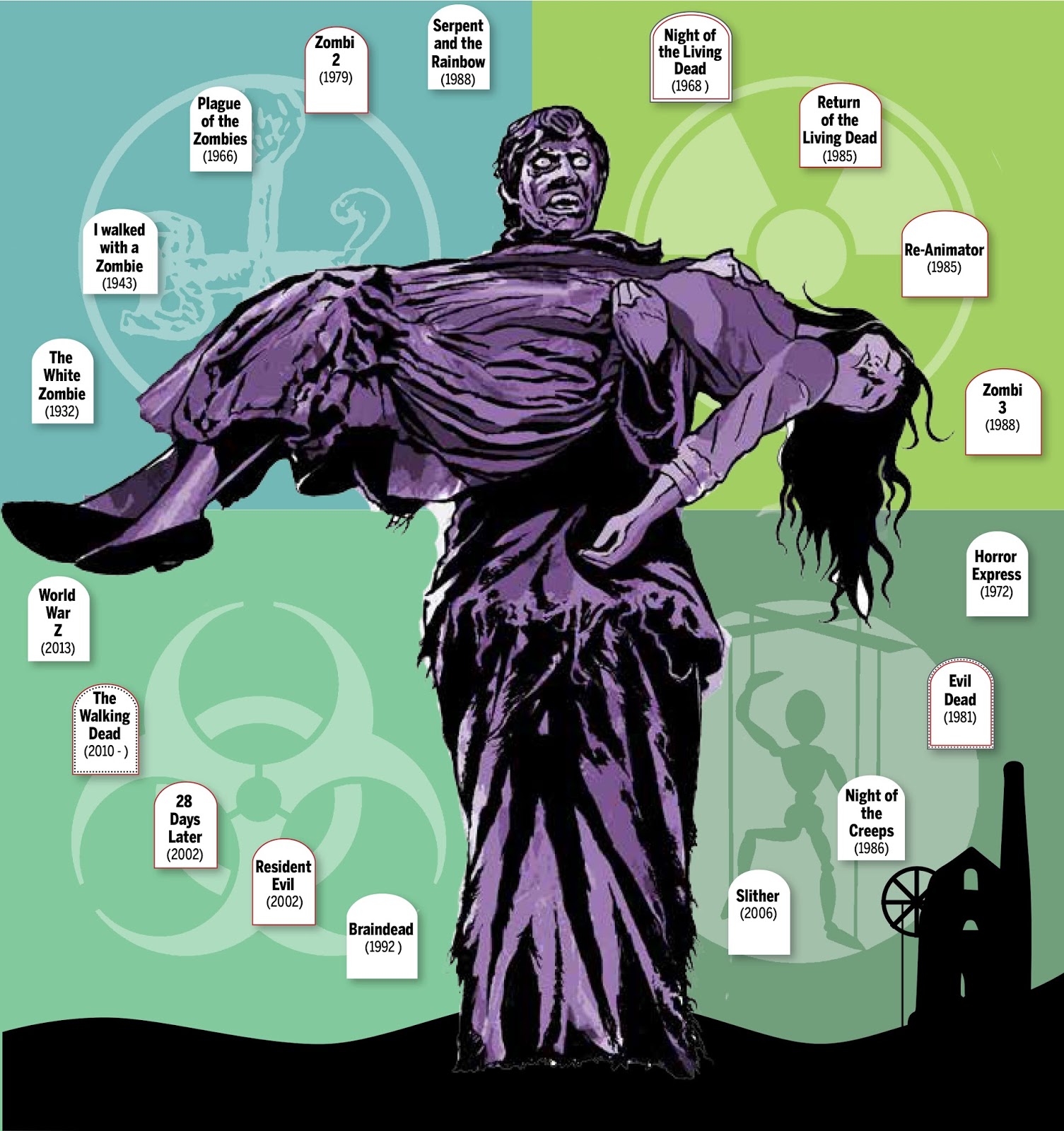
Dracula's hand look a bit weird? Well, yes, my own was the model, dislocated pinky and all...

On the 30th September, 2016, I sent out a poorly-written and probably very naive book proposal to a number of publishers around the world.

Despite my lack of experience, Telos Publishing in Britain expressed some interest a few days later. And looking back, I see that they actually responded on my mother’s birthday, which is surprisingly appropriate.
Mum passed away in 2009, but more than anyone encouraged my young interest in science fiction, fantasy and horror - and the films of Hammer.

A month short of two years in the making, Infogothic: An Unauthorised Graphic Guide to Hammer Horror is now finished. A celebrity introduction from a busy and much-loved actress was a long time in coming, but once it arrived (and the wait was well worth it) things began moving very quickly indeed.

I’ve written about the book’s long gestation here:
http://fasmatodea.blogspot.com/2017/03/getting-hammered.html
http://fasmatodea.blogspot.com/2017/08/getting-hammered-pt-2.html

and felt it appropriate to round off with this conclusion. A 'Karnstein trilogy', if you like.

Infogothic is due for release this Halloween (set back a full year after the lengthy fact-checking and proofing found us with no time left in 2017), but is available for pre-order now.

Some wonderful friends have even signed up already - and I am busy gratefully building shrines to them now.
Forgive me if you’ve already seen me 'pimping' my book everywhere, after so much work I can’t sit back just yet.

Like a shonky Hammer bat, my unholy progeny has just flapped shakily out of the castle window, and is now unleashed upon the world. I hope it finds happy roosts in other Hammer fans bookshelves.
https://telos.co.uk/shop/film/infogothic-hammer-horror/

"More than sixty years ago, Hammer Horror first exploded onto screens in a splash of vivid colour. Over the following two decades, the studio redefined horror cinema and crafted an often-interconnected world of gothic fantasy. The many graphics, diagrams, illustrations and maps within these pages will take you on a journey through the ‘Hammer-verse’ (most likely by horse-drawn coach). Pursue Count Dracula through the centuries, reconcile the many versions of the careers of Frankenstein and Quatermass, translate the curses of ancient Egypt and explore ‘Hammer time’ from doe-skinned prehistory to plastic-clad future.

Everything you ever wanted to know about Hammer’s horror films is contained in this incredible graphic guide. Charts, templates, diagrams and illustration take you through all the facts and figures. From the relative heights of Frankenstein’s Monster, to the actors to have played Dracula … no stone is left unturned in this compelling and fascinating look at the films which redefined ‘Horror’ for a generation.

“Truly original and wonderfully illustrated” – from the Introduction by Caroline Munro

96pp. 11 x 8 paperback book in full colour.
ISBN: 978-1-84583-124-0
Published 31 October 2018"

Thursday, 18 January 2018

The Omega Man


It's funny what you can discover when you're packing up to move house.


I've seen that author's name somewhere before...
no idea what happened to the the illustrator, though

For decades I have carried around two A1 sized boxes stuffed with select work I'd produced at Design School in the mid 1980s, to freelance illustration in Scotland in the early 1990s.

Most of it is horrible and finally needed to be got rid of on a bonfire of inanities. But a few exceptions also exist, a tiny stack of scribblings which, more through accident than design, manage to hold up. By my standards, at least.
Among these are some illustrations I did for an Edinburgh-based magazine called Scottish Field, established in 1903 and despite publishing some of my work in 1993/94 are still going strong today.

These commissions came at a time when I really needed the money, and confidence boost, and were for a series of whimsical short stories about a retired butcher called Bodie who becomes a private investigator.

I'd supply two black and white roughs, then a colour rough for my
own reference, and finally the finished art in watercolour and ink.

I realised that I'd actually kept some copies of the magazine itself, and turning to one of these stories was struck dumb by a realisation twenty-five years after the fact (I can be slow on the uptake, but a quarter of a century for the penny to drop has to be a record).

The author of these stories was a man called Jack Gerson. And this might not have even meant anything to me now, if I hadn't written blog post about a television series and book which I took into my sad little geek heart so many years ago:
http://fasmatodea.blogspot.co.nz/2015/08/the-omg-factor.html

I had been illustrating stories by the writer and creator of The Omega Factor and hadn't even realised it.

It won't mean much to anyone else, as my wife's rather bemused expression conveyed when I shrieked this discovery. But this 'one degree of separation' rather rocks my world, sharing 'journalistic real estate' with a storyteller who's skill fired my imagination as a teenager and still does even now. And made all the more poignant by the fact that I was gormlessly unaware at the time.

But perhaps it's just as well, my Fanboy reaction and inevitable stalking of Mr Gerson might have only earned me a restraining order and termination of contract.

Finding an obituary, I discovered that Gerson passed away six years ago, leaving a huge body of work to the world.
The last writing he did was a radio play called Bodie’s Occupations, featuring, yes, the very same character whose earlier adventures I had illustrated.

The connections don't end there. As anyone who has to listen to me for longer than 5 minutes knows, I am currently writing a book about Hammer films, which has absorbed a huge part of my life recently.
The concept of 'Hammer Horror' really began with a 1957 film called The Curse of Frankenstein, starring Peter Cushing and Christopher Lee in their first film together. Second billing went to a Scottish actor called Robert Urquhart, who played Frankenstein's tutor and eventual accomplice, Paul Krempe.

Urquhart himself had a long and illustrious career, and one of the final things he did before his death in 1995 was a certain radio play by his old friend Jack Gerson, where he took the title role of a private detective called Bodie.

My preliminary sketches for Bodie's appearance and
(inset) actor Robert Urquhart, who eventually played him on radio.

Friday, 25 August 2017

Getting Hammered Pt 2


So you want to write a book? Be careful what you wish for…


Hello again dear, neglected blog. It’s probably just you and me listening, but I’m still going to write about how it feels to have got the first draft of Infogothic: An Unauthorised Graphic Guide to Hammer Horror, completed.

I’m sure such people must exist, but off-hand I can’t think of anyone else foolhardy enough to do every aspect of a project like this single-handedly.  In my day job I’ve been fortunate enough to be given opportunities as a published writer, designer and illustrator. I’ve designed books, researched information graphics and wrestled with the myriad technicalities of preparing a complex document for print.
So, why wouldn’t I do it all myself?


To answer to that question - I need to remind myself of the following: 
I have spent the last seven-and-a-half months working every possible spare hour I could find in my day, on this book. Whenever possible, I’ve started my day at 4:30am and worked in a freezing room (hello chilblains) until my day job or a grumbling stomach intervened.
I’m not a night owl but have burned the other end of the candle, too. I found that if I could get past my ’pain threshold’ of 10pm, I would end up having to make myself go to bed in the wee hours of the following morning.
Exercise has fallen by the wayside, as has sometimes even leaving the house. And to myself at least, I definitely look older. 
I’m not looking for sympathy though - I’ve loved every minute of it.


Whatever happens next, I hope that love comes through in this book.  My publishers might demand extensive changes, or lose confidence altogether. Even after it’s published I might end up with a garage full of unsold volumes, gathering dust and cobwebs like a Hammer film set.

But you know what else?  I’m proud of it. I’ve put everything I have into this book - most of my annual leave, every ounce of effort and what might pass for talent that I possess.
But not for a second am I forgetting any of the wonderful people who’ve supported and helped me - I will definitely thank them all properly in due course. But for now, you know who you are.


It’s an unusual product in an already very narrow market, but I know the ‘Monster Kids’ are out there - those of us who grew up adoring our horror films and learning to appreciate them like fine wines as they, and we, age.
I hope Infogothic finds them - and hopefully you - eventually. 

But for now, there is still some way way to go in bringing my very own ‘unholy creation’ to life.


Saturday, 25 March 2017

Getting Hammered

Hammer horror, Hammer horror,
Won't leave it alone.
I don't know,
Is this the right thing to do?”

(Kate Bush)

Warning: spending too much time in your room could leave you looking like this...
(from Infogothic: A graphic guide to Hammer horror)

In my pre-teens I didn’t go out much. I spent too much time in my room and didn’t interact nearly enough with the real world. I didn’t do anything physically active, and if the very thought was not ridiculous to someone who still names his blog after a stick insect, I would almost certainly have been overweight and unhealthy. Instead I was immersed in a fantasy world of my favourite films and TV, pouring over books and magazines and writing and drawing pictures about them. It’s little wonder I had the social skills and physical coordination of a baby giraffe when hormones finally propelled me out of my bedroom.

Sometimes it feels as if I’ve lived my life trying to make up for this ever since - forcing myself outside in all hours and weathers for physical pursuits I might not even be very good at, pushing myself into social situations I’m probably equally ill-suited to.

So how utterly bizarre it is to come full circle all these decades later.

Instead of my bedroom, I now spend all my time at a keyboard in our office, and as much as I miss regular exercise, I’m still a stick insect. I’m even secretly glad we’ve just had the worst summer in living memory because I wouldn’t have been able to spend much time out in it. Much else has been neglected - needless to say this blog has been one of them. My wonderful wife has been incredibly patient and tolerant, only making occasional remarks about the anatomically-impossible position she believes my head to be lodged in, most of the time.

And I’m (only just) getting away with this blindingly anti-social and monstrously selfish behaviour because I’m writing a book, with a signed publisher’s contract and everything.


Coming soon...
I can’t remember the first Hammer film I actually saw, but do recall seeing a couple of seconds of a fanged, hissing Christopher Lee in an episode of Some mothers Do ‘Ave em when I was very young. Always like Frank Spencer in so many ways, this made an instant impression on me.

It’s taken forty-something years, but I’m now researching, designing, writing and illustrating a 94 page soft cover book about the horror films of Hammer Studios.
Very aware these productions have already been analysed, dissected and evaluated in molecular detail by authors all across the world (I was reading some of their books in my bedroom all those many years ago), I pitched a very different approach which astonishingly attracted some interest from a british publisher.

Over the last decade my day job has required me to produce infographics (information graphics) - visual representations of information which can be absorbed quickly by a reader, rather than having to be excavated from large bodies of text. These can be charts, diagrams, maps, graphs, schematics, illustrations - any visual device which analyses and informs.

Apart from the fact that successive generations of film fans are now delving deeper and deeper into the backgrounds and minutae of their favourite films, the perennially popular output of Hammer studios lends itself perfectly to this treatment. As with so many of their decisions, Hammer’s body of work was driven by cost considerations. Sequels were an efficient way to reuse props and costumes and calling upon the same actors familiar with the Hammer method of working saved time, as did reusing directors, writers and technicians.


The result of this ‘business model’ is a vast, interconnected world stretching across two decades of film-making. Sometimes it’s the fictional characters and settings which form the connective tissue, and sometimes it’s real-world factors. Either way, this gives me plentiful data which can be sifted and arranged into (hopefully) attractive and engaging infographics.


Will Infogothic - A graphic guide to Hammer horror sell? Will it actually see the light of day - will I even make my deadline? Even I’ve learned that many uncertainties lie between a project and a product in this industry.
The single best thing which has come out of this incarceration is the incredible generosity of fans and authors all over the world which I’ve encountered. They have been unfailingly encouraging and helpful with my every request and enquiry. I’m still reeling from the incredible kindness of one author who sent me a PDF of his entire out-of-print book for my own reference. Like Hammer films themselves, although the subject matter itself was often sensationalist or even tawdry - it was always executed with pure class.

This post is already longer than I intended, so it’s back to work. I’m not sure when I’ll return to this blog, but I definitely will - there’s been so much else to write about this year.
In the meantime; I’m learning a lot - not just about Hammer itself, but history, geography, languages and literally, rocket science. And I’m currently working on a fashion spread, charting the costumes of Hammer heroines from Raquel Welch’s doe-skin bikini in One Million Years BC to the PVC futurism of Moon Zero Two. So don’t feel sorry for me - and if you like what you hear - buy my book!


Friday, 12 August 2016

Front Drawer

A touch of gloss can make anything look good!


All the astrological symbols have been customised
 to relate to the satirical predictions in the article

It’s been quite a year for illustration commissions, due in no small part to the fact that I am one of the few illustrators left in our organisation.  I’m possibly also the only one stupid enough to work all hours because I don’t want to turn the opportunities down.

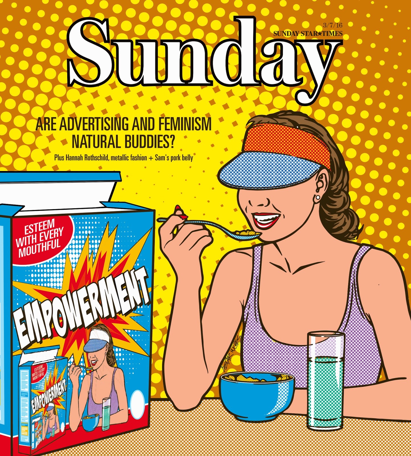
Putting the adverse effects on my health and family life aside, here’s a gallery of covers I’ve illustrated for the Sunday Star Times Sunday magazine this year.  

The SST seem to like me because, rather than ever really establishing a style of my own, I rip real artists off.  Or homage them, if you prefer. And Sunday is a glossy supplement - so the stock quality helps  me look good most of the time…

In the style of: Frankie magazine

In the style of: Roy Litchenstein

In the style of: The New Yorker

In the style of:  hang on, this just might be my own! Fancy that...

Not in the Sunday Star Times magazine section, but in the style of:
Soviet propaganda posters

Wednesday, 20 July 2016

Cartoon carnival


How difficult can it be to be funny once a week?

NZ makes great films, but we'll always go back to 'hooning' (hopefully)

That lame title might give you an idea.  When 'I were lad' the local cinema used to present a ‘cartoon carnival’ - basically splicing together a whole programme of the cartoons which they usually played before movies.  Mr Magoo and Huckleberry Hound were all good and well in isolation, but a whole afternoon in the company of them and their friends could pale somewhat.
But the cinema made money and our parents got us out of their hair for a couple of hours.

This year I have been given a weekly cartoon to do - which sounds like, and is fun, but is not easy.
The only real stricture I’ve been given is to stay away from NZ politics, so as not to encroach on the sterling work of our immensely talented daily cartoonists. 
Mine is weekly, so I have to try to pick a subject which is current, but won’t be completely out-dated by the time Saturday rolls around.

The audience is predominantly female and probably looking for an amusing Saturday morning breakfast diversion rather than razor edged satire.  
There was much I wanted to say about Brexit, not so much about Britain's decision but the condemnation from other nations. Suddenly appearing to know all about the European Union and exactly what it meant for people living in the UK, questionably-informed shaming was sprayed all over social media. And as for critics from the US - get your own house in order first. PLEASE.
It’s a huge subject which I don’t know a great deal about either, so I’ll stop now - and I submitted a very non-judgemental illustration instead.


I try to keep it light, and possibly even amusing every so often. I will be taking swipes if I think an issue or person deserves it, though - I'm holding the pen!
But I have to admit it causes me agonies of self-doubt and apprehension every time I send a new cartoon for approval - so if any of you have ideas - do let me know!

A pet-hate of mine - and everyone else's apparently

And if you can't be funny - try going for a wry smile instead...

Saturday, 2 July 2016

Moving the story along

Pressure to increase an on-line presence for my graphics
could lead to a motional rescue


I started by adding some subtle motion to this earlier illustration -
branches swaying gently in the breeze didn't tax me too much for a first attempt.

When I began illustrating the very funny Leah McFall's column for the Sunday Star Times magazine, the simplistic style which the editor and I developed together has since turned out to be easily adaptable for animation.
Well, I say easily, but I'm not a fast learner.  I had to teach myself how to create an animated gif file and then wrap my head around a way to bring my images into the realm of motion which didn't look jarring, crass, or just weird.

I'll let you be the judge (and do follow the links below each animation if you have time, not only do the stories put the images in context, but Ms McFall is also a spectacularly witty writer).

The joys of listening to the radio was difficult to illustrate,
but somehow moving sound waves convey the idea better.
Believe it or not - this gently undulating wisp of steam rising
from the tea cup was the most difficult animation yet.

A rare, more serious story, about post-natal anxiety.

http://www.stuff.co.nz/life-style/parenting/baby/81871724/Leah-McFall-Enduring-postnatal-anxiety

Monday, 28 March 2016

Drawing out a story

I’ve been given a weekly column to illustrate this year, and like a wet tea-towel fight, it can be daunting, but fun.


Surviving in a modern working environment

The author of the column’s observations are not only perspicacious, but delivered with the kind of self-effacing wit which makes me LOL embarrassingly while reading through the latest draft during my commute.  I wish I could write with a fraction of the sharp and droll perception of the every-day that Leah McFall does.  But best of all, I know she likes the artwork I’m contributing to her page because she took the time to write me a lovely email saying so.

The other force behind the page is the Sunday magazine editor, who I have also never met but communicates regularly by phone and email.  She has a very young-sounding voice, but I wouldn’t make the mistake to equate this with inexperience.  Refreshingly she also isn’t shy to prescribe a style when she commissions artwork for me. Sadly, I’ve known illustrators who throw down their brushes and flounce dramatically from the room at the very thought of this, but I like it.

Having reached 50 I still don’t especially have an illustration style of my own, and am only too happy to bend, stretch and insinuate myself into a technique established elsewhere, if it works for a particular brief.  I like to think of myself as a chameleon, but maybe I’m really more of a plagiariser…
By coincidence, the editor suggested a style which I had experimented with for an essay illustration over Christmas.

Not an illustration for the column, but a kind of prototype of the style,
accompanying a Christmas tale about a disastrous family holiday.
I can recognise that producing an unself-conscious, expressive line is one of my weaker areas, so I’ll avoid outlines where possible, and fortunately the technique suggested completely avoids them.
Here is a selection of the illustrations so far.  The column itself, in the Sunday magazine supplement of the Sunday Star Times, can also be found online by following the links below these images:

The fine art of small talk - a random conversation with a fisherman.

An imaginary photo-shoot described in a column about ageing gracefully(?)


"Mummy, why can you see the moon in the daytime?"

Some surprising information comes to light about a favourite children's YouTube series.

Saturday, 12 March 2016

Size sighs

The stick who walks is giving some stick back


Apparently I was a chubby infant, but have been what is commonly called 'skinny' for as long as I can remember.

Clothes I wore as a teenager would probably still fit me now - until the opposite of liposuction is invented nothing is ever going to put weight on these bones.  I still have to put an extra notch in every new belt, and my decent height means that trouser shopping for a particularly absurd ratio between waist and leg measurements can take all day.
First world problems, right?

Don’t get me wrong, I don’t make a big deal of it, but other people sure like to.

It's certainly no news to me that remarks are directed at those sharing my body shape with a degree of casual cruelty that no one would dream of using on an overweight person. Not in these apparently more sensitive and enlightened times.

It’s a shame that the occasions when these comments have hurt me the most is when they’ve come from friends. But as we all continue to age I suspect there might be increasing amounts of envy in those remarks - who knows.
Who cares?

Well, apparently some people do. In the space of a year I’ve just completed my second illustration for an article about what is apparently now known as ‘thin shaming’. The first was written by a male broadcaster whose modest physical stature comes from his family’s Asian origins (below), and the most recent has been a compendium of interviews with a variety of women (top of this post).


It makes compelling reading, but my own experience leads me to conclude that unless the result is physical or psychological health problems, (and make no mistake, it can be), there are far worse things to be ‘shamed’ for.
During a long stint in martial arts, the look on every single opponent's face at the moment when they realised that, despite appearances, I wasn’t going to blow away after their first punch, was all I ever needed to cope. (Well, not their very first punch, anyway).
Maybe writing a blog named after a stick insect also demonstrates the arrival at a certain amount of peace with a lifetime of putting up with size-est nonsense.

The article I've illustrated ends with a much better solution, however. Simply put: perhaps we all just need to be kinder to each other.


Monday, 28 December 2015

Drawing to a close


As 2015 nears the finishing line, we cue the ‘Vision On’ gallery music and take a quick look at some of the year’s events, in pictures wot I drawed.

The 2015 Budget was notable for our Finance Minister failing to hit the surplus.  This is my William Tell overture to this feat of marksmanship...

Still on the subject of men at the top: I’ve had a thing for ponytails in my time, and once even been enough of a tool to playfully 'bat' one - but I was young and stupider, and certainly not leader of the country.


The first time I ever heard Jonah Lomu’s name mentioned, I hadn’t been long back in the country, was still a bit out-of-step with the accent, and assumed the speaker was talking about Joanna Lumley. But despite my general sporting ignorance, reading the Oscar Kightley’s article about Lomu’s contribution to his Otara community made me very happy - and privileged -  to illustrate it with this collage.


Three funny-looking sisters called Fern, their brother Koru (who no-one takes seriously), and their new sister Redpeak, who everybody loved.  I have no idea what this Kiwi fairytale by the very witty Matt Suddain was about, have you?

And lastly:
We’ve all made ourselves forget, but the last time a new Star Wars film came out, some people ‘Force manipulated’ themselves into believing they really liked it.  I unearthed this drawing I did back in ’99, where I seem to be an inept and very un-intimidating Darth Maul, receiving a kicking from two Jedi workmates.


If you are on holiday (or even if you aren't) enjoy the last couple of days of 2015 everybody!

Wednesday, 12 August 2015

Drawing on the Classics

Nothing could be more boring then talking about work, but the truth is, I've had some fun stuff to do recently.


Auckland Journalist Siena Yates ran a two part feature in Fairfax's Your Weekend magazine cover the last two weeks, taking a look at the perceived New Zealand ideal for men and women.

This was quite rightly deemed cover material and I snatched up the opportunity to produce the illustrations, although I was also aware this topic could be somewhat contentious. As we all know, humour is the often best approach in these situations, and Sarah the editor seemed to agree.  The Male cover was up first, and she listed these unearthed attributes, athletic, financially independent, good with a barbeque, adept with DIY, a beer drinker and, surprising no-one, an All Black with a farming background.  As I wondered how on earth I was going to combine all of these elements into a single image, she contributed the final element which suddenly made it all click together: "perhaps something like an anatomical drawing..."


Vitruvian Man by Leonardo da Vinci
Da Vinci's Vitruvian Man might have been used in popular culture to the point of cliché, but he does have the advantage of having four hands to hold some tokens of the elements required (a beer can, hammer, barbeque fork and credit card).  Gumboots and an All Black jersey were easy to add and it almost drew itself.  I was keen to keep it in the style of the original drawing, rather than try to 'update' it, because why wouldn't you preserve the essence of this timeless image as much as possible?
Vitruvian Man was drawn by da Vinci around 1490, based on the correlations of ideal human proportions with geometry described by the ancient Roman architect Vitruvius.  He believed that the human figure was the principal source of proportion among the Classical orders of architecture, and da Vinci's figure describes geometric forms, surrounded by notes on human proportions written in his reversed 'mirror writing.


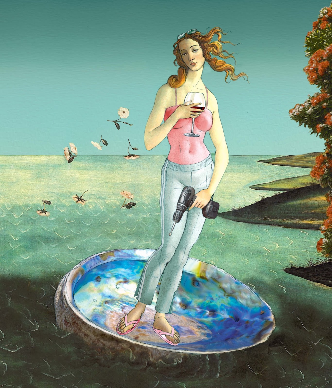
The following week's female version was arrived at very quickly with an equally well-referenced classical artwork, actually painted within ten years of Vitruvian Man, by Sandro Botticelli in Florence.
The Birth of Venus is long held as an ideal of feminine beauty, but unlike da Vinci's work is not routed in real anatomy or even physics. (As well as being improbably proportioned, Venus would not only topple over but also take the scallop shell with her).


The Birth of Venus by Sandro Botticelli
The curiously linear and unfashionably 2-D approach which Botticelli takes also suited me because of the even quicker turn-around time for this cover.
Elongated neck or not, Venus proved well-suited for adaptation to a kiwi ideal, her hand positions easily able to brandish symbols of casual sophistication (a glass of New Zealand Pinot Noir) and can-do independence (a power drill). Track suit bottoms and jandals conveyed the findings that New Zealand women appear to simply care less about embodying a feminine ideal, while turning the scallop into a paua shell was as inevitable as the All Black jersey on the previous week's cover.


As I mentioned, this series of articles and covers could have been rife with difficulties, attracting the outcry which media generalisations so often do.  The fact that the subject was treated with some degree of humour appears to have distracted from this, perhaps reinforcing the conclusion that New Zealanders appear to take body image a little less seriously than some cultures do. 'On ya!